

Coursera Guided Project
Transformed an Acquired Platform for Hands-On Technical Learning
Introduction: Expanding Hands-on Learning at Coursera
In 2019, Coursera acquired Rhyme.com, an interactive learning platform designed to facilitate hands-on skill development. While Coursera Labs already provided longer-duration, deep technical learning, Guided Projects offered a lightweight, ready-to-use cloud desktop environment, making it easier for learners to quickly apply skills without complex setup.

Problem & Opportunity
However, integrating Guided Projects into Coursera’s ecosystem came with key challenges:
User friction in navigating between instructional content and hands-on tasks.
Limited engagement and adoption among enterprise learners seeking upskilling solutions.
Scalability and accessibility issues in providing a consistent experience across various devices and user backgrounds.
Unclear positioning within Coursera’s broader learning ecosystem.
Guided Projects had already proven valuable in organizations for:
New employee onboarding – Training employees on essential tools to increase productivity.
Technology adoption – Helping teams improve workflow efficiency by mastering new technologies.
New technology rollouts – Supporting company-wide success in digital transformation initiatives.
Application-specific workflows – Scaling expert knowledge across teams.
With the growing demand for practical, job-ready learning, the goal was to seamlessly integrate Guided Projects into Coursera’s ecosystem, clarify its positioning, and drive enterprise adoption to enhance Coursera’s hands-on learning offerings.

My Role & Approach
I led the UX design efforts for Guided Projects, collaborating with product managers, engineers, and UX researchers to optimize the hands-on learning experience. My focus was on improving engagement, usability, and enterprise adoption. My approach involved:
Collaborating with UX researchers to gather user feedback from both external learners and internal stakeholders to identify pain points and friction in the existing experience.
Aligning with business goals to drive enterprise adoption through an engaging, job-relevant learning format.
Designing and testing interaction models that improve usability and completion rates.
Ensuring accessibility compliance and responsiveness across web and mobile devices.
Target Users
Guided Projects were designed for learners seeking hands-on, job-relevant skills in a short timeframe. The primary users included:
Individual learners looking to quickly upskill.
Enterprise employees undergoing corporate training for digital transformation.
Educators and trainers integrating Guided Projects into structured learning programs.

Learner Challenges & Pain Points
User research and internal feedback from Coursera employees who took Guided Projects revealed several key pain points.
Inconsistent Experience
Difficult Pane Management
Lack of Platform Clarity
Completion Confusion
Limited Accessibility
Navigation & Usability Issues
The video lesson list was difficult to discover, with little guidance on progress.
The middle panel’s function was unclear, with learners wanting the option to remove it for a larger screen.
Chat notifications were distracting—users wanted a better way to manage them.
Inconsistent Experience
Rhyme’s UI, functionality, and design felt disconnected from other Coursera experiences, creating a fragmented user journey.

Difficult Pane Management
Users struggled to navigate multiple panes, making it hard to follow instructions and complete tasks.
Screen resizing controls (expand, collapse, dock, handlebar) were hidden or unintuitive.


Lack of Platform Clarity
Key platform mechanics (e.g., session time limits, return policies) were unclear, leading to user confusion.
Completion Confusion
No clear progress indicators left learners uncertain about when a project was fully completed.
Limited Accessibility
Rhyme lacked essential accessibility features, such as closed captions and scalable UI elements, making it difficult for all learners to engage effectively.

Navigation & Usability Issues
The video list was difficult to discover, with little guidance on progress.
The middle panel’s function was unclear, with learners wanting the option to remove it for a larger screen.
Chat notifications were distracting—users wanted a better way to manage them.


Defining the Goal
Based on user feedback and research insights, the project focused on the following key goals:
🎯 Create a Unified and Cohesive Learning Experience
🎯 Enhance Onboarding and Platform Clarity
🎯 Improve Navigation and Interaction Flexibility
🎯 Improve Accessibility and Inclusive Learning
Design Process & Iteration
Side-by-Side Window Autonomy
Empowers learners with a flexible dual-view layout, enabling them to follow instructions while actively engaging with their cloud desktop.

Side-by-Side Window Resizing Test
Evaluates the adaptability and responsiveness of the dual-view layout, ensuring seamless resizing for optimal usability.
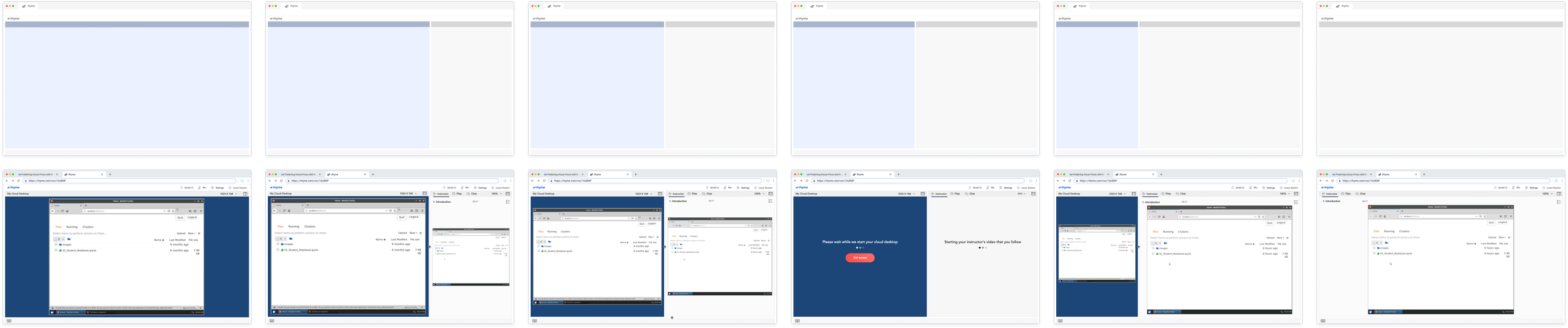
User Testing & Key Findings
To ensure an intuitive experience, we conducted moderated usability tests with 11 learners, focusing on navigation, interaction, and usability pain points.
Onboarding Clarity
Most learners understood the split-screen setup
2 of 11 found the term “Cloud Desktop” unclear.
Navigation & Resizing: All participants successfully adjusted window size, resolution, and zoom.
Time Limit Concerns: All learners felt anxious about the Cloud Desktop time limit and expected an option to extend.
System Support & File Management
All expected auto-save for progress when pausing/resuming.
Most wanted a way to save/copy work at critical moments to avoid losing progress.
These insights helped refine navigation, onboarding, and system support for a smoother learning experience.


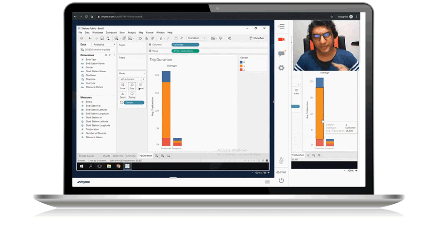
Application Header
Oversees learning session management, including time limits, progress tracking, and session settings.
Learner Desktop Header
Controls zoom, screen size adjustments, and displays relevant information such as notifications.
Learner’s Cloud Desktop
Provides a pre-configured environment with applications and lesson files, enabling learners to follow along with instructions during the session.
Instructor Desktop Header
Manages zoom, screen size adjustments, file access, and session discussions.
Instructor’s Cloud Desktop
Displays either a list of pre-recorded video lessons or a full desktop for live sessions.
Keyboard
Displays the code being typed by the instructor during the lesson.


Outcome & Impact

Coursera-Branded Experience
Unified the look and feel with Coursera’s logo, design components, and UI patterns for a seamless learner experience.
Enhanced Onboarding Support
Introduced guidance messages to help learners navigate the platform more effectively.
Standardized UX Patterns
Improved interactions, icons, labels, and controls, including a zoom and resolution selector, aligning with industry best practices.
Extended Cloud Workspace Access
Provided increased access time with an option to extend for greater flexibility.
Improved Accessibility
Added closed captions and other accessibility enhancements to support a more inclusive learning environment.
Key Takeaways
Technical Challenges
Standalone Platform: Guided Projects run on a separate platform, preventing reuse of Coursera Labs’ existing codebase.
Frontend Consistency, Backend Independence: While we maintained Coursera branding on the frontend, the backend remained entirely separate.
Integration Concerns: The lack of a shared codebase raised challenges for future feature integration across Guided Projects and Coursera Labs as unified hands-on learning platforms.
Insights and Learnings from the Design Process
Seamless Integration: While leadership prioritized a fast launch, I focused on evaluating the UX and journey to ensure a smooth user experience.
Proactive Problem-Solving: Addressing obvious user pain points early improved platform scalability and long-term usability.
Future Opportunities: This integration paved the way for a fully unified hands-on learning experience, enhancing technical learners’ journeys and driving tangible outcomes.


